Overview
Slowve is a LEAN UX project based on slow-living trend, applied to divorces and couples that want to keep their spark of love alive. Slowve is a suscription to love.
We know that love is prescious and needs to be cared, and also we believe in second opportunities for love.
Main info
LEAN UX
Desk Research, Benchmarking, LEAN Canvas, User stories, Protopersona, Analytics, Moodboard
2 weeks. Project team:
Carmen Sánchez and María Dávila
WordPress, HTML5, CSS, Miro, Figma, Airtable, Mailchimp, Hotjar, Google Analytics
Briefing
The Slow Life movement, which emerged in the the 1980s, has experienced a resurgence as a result of the pandemic. COVID-19 has called into question the suitability of an accelerated pace of life in all areas of our life.
People are increasingly looking for a a restful and reflective existence in which everyday activities, which used to be unnoticed, are rediscovered as a ritual and become opportunities to reach the communion with our environment.
The lockdown has put our patience in check, we has faced loneliness, anxiety, the desperation and mourning for the lives lost… but, paradoxically, it has also put on the table the opportunity to slow down our pace of life.
Discover
We started the project with a short preliminary research. We needed to really understand what basic guidelines the Slow Movement should follow.
What is the concept of the movement?
What was its purpose?
In which areas is it usually applied?
To better understand the Slow Movement, we also implemented a Slow Life philosophy in the team for the development of the project. And so we measure our productivity and satisfaction with the results.
After understanding the basics of the Slow movement, we empathized with the protopersonas.
What are the main pain-points of users in their daily routines?
Some of them we discovered are:
Getting overloaded before time, long working days, information-laden routines, saturation of space, full events and meetings schedules, technology, etc.
Therefore, once we understood the user better, we start looking for solutions and proposals to improve the quality of life for the user. We devise many proposals such as: a voice assistant that puts you in context and reminds you to calm down, a notification control for the mobile phone, slow-dating platforms (as opposed to fast-dates), planning and structuring of the companies’ work routine, etc.
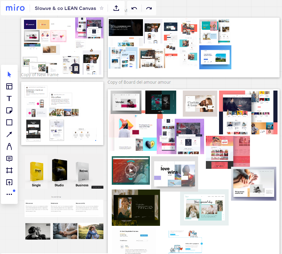
Miro canvas of all the working process of Slowve
Define
After brainstorming, we realised that many of the ideas were already made and we wanted to make a more attractive and innovative product. We began to select the most interesting ideas and started to go deeper into the most striking issues.
We found a very powerful insight that fitted the current situation of lockdowns that could be of great interest to the market. These were the alarming data we had discovered about divorces and problems between couples as a result of these lockdowns.
Later on, we came up with a inspiring and emotional video, which encouraged us to continue with this idea.
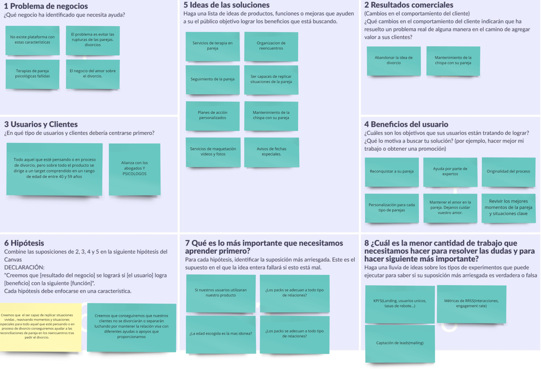
The LEAN UX canvas is very similar to the business model canvas. This canvas helped us position ourselves and develop our project effectively. It summarizes and clarifies all the process of the project.
The name of the project had to be attractive, short and had to clearly reflect the love value of the project. Therefore, we opted for a wordplay of Slow + love = Slowve.
Slowve is an emotional project where feelings play a fundamental role.
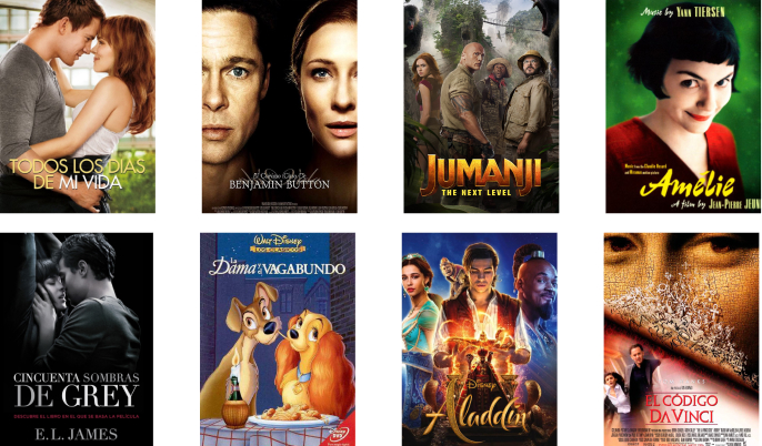
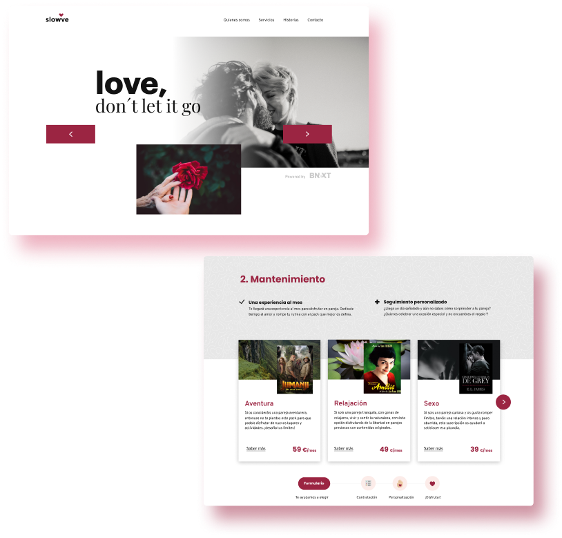
In order to be more familiar with our users and connect with them with emotions, we linked the packs to very well-known films. Attaching the services we offer to the emotions felt by the user from the film. Making the pack more eye-catching and above all, selling a feeling rather than a product.
We designed a clean interface, taking much care about color saturation.
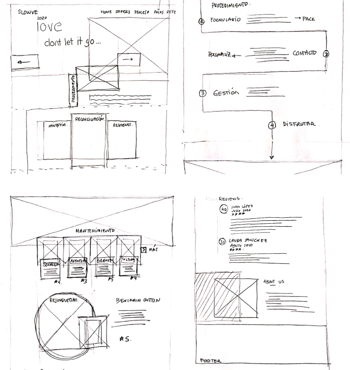
A picture is worth a thousand words and images convey emotions better, so we decided to give them the leading role in the design. We clearly differentiate the sections controlling horizontal and vertical rhythms. We also made some effects (parallax), at certain items to improve the interaction between the user and our design.
We develop a style guide and established a visual hierarchy both at a typographic scale and in the structure of the page. We took care of the proportions on all the information to avoid generating visual load. We also adapted the design to be responsive for phones and labtops.
Analytics
Google Analytics, Hotjar and Mailchimp.
I believe that a good visual layer must be supported by a good inteaction design. User interactions with our designs underpin the success or further iteration of our designs. I consider myself a designer who believes in data-driven design as the cornerstone of a product’s success. Therefore, my designs are always subjected to feedback, analytics and metrics to determine if the objectives are met.
